Mindspace Application
About the project
User Research
Before designing Mindspace, I ran a survey to understand the everyday patterns behind people's mental and emotional wellbeing — questions around relocation, emotional exhaustion, sleep habits, meal skipping, and food choices. The responses showed clear patterns: a majority had relocated away from family, many reported feeling emotionally tired several days a week, sleep hours varied widely, and skipping meals or eating out of convenience rather than choice was common.
These findings directly shaped the app's core features — validating the need for mood tracking, sleep reports, food logging, and a journaling space as core pillars of Mindspace, rather than just guessing at what users might want.

Sitemap
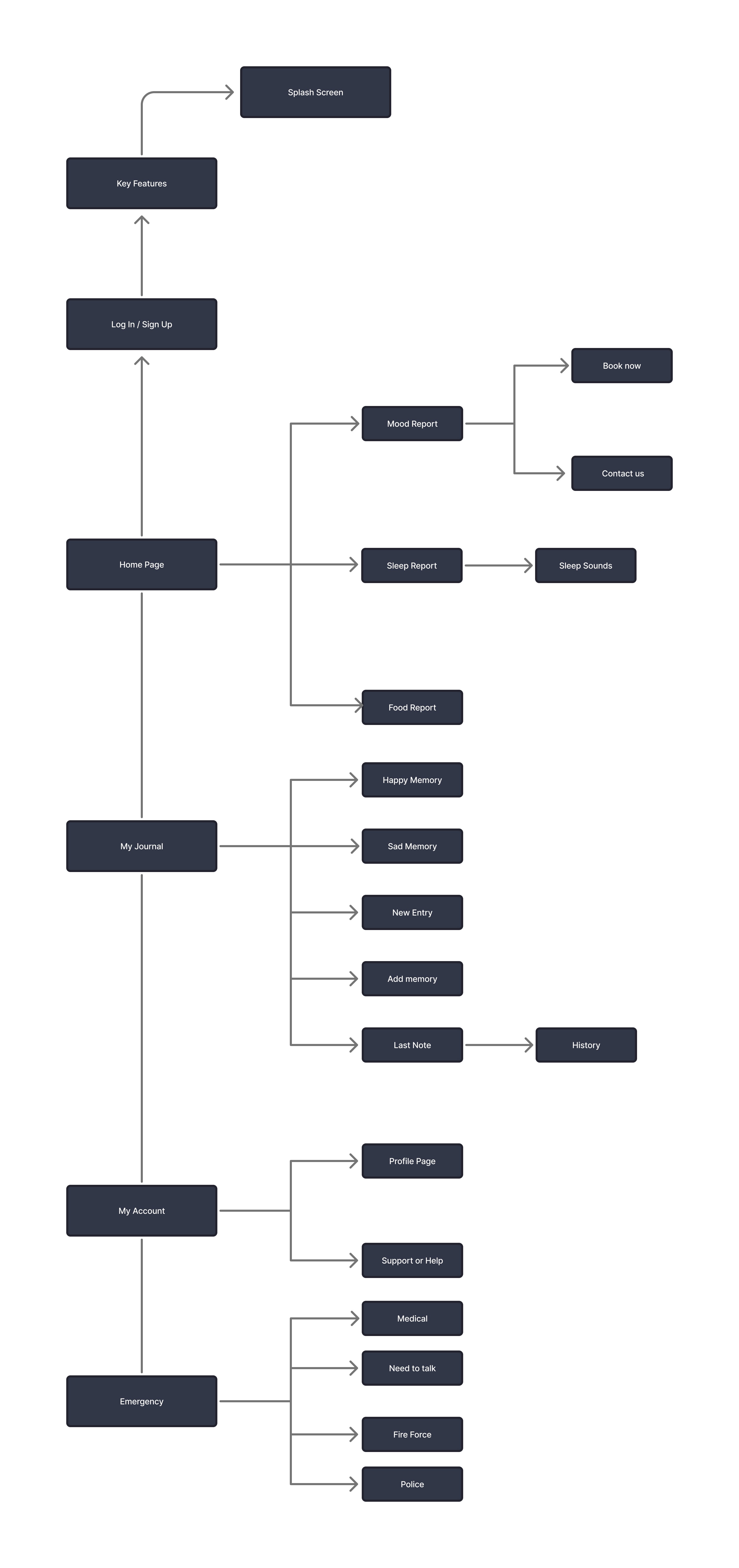
Once the research pointed to the app's core pillars, I mapped out the full structure of Mindspace to make sure every feature had a clear place and clear path to it. The sitemap starts at the splash screen and login/sign-up flow, then branches into the Home Page — covering Mood Report, Sleep Report, and Food Report, each with more specific screens like booking a session, contacting support, or accessing sleep sounds.
Alongside that sits My Journal, where users can log Happy and Sad memories, add new entries, and revisit their history — and My Account, covering profile management and support. I also included a dedicated Emergency section, giving users quick access to medical help, someone to talk to, or emergency services, since a mental health app needs a clear path to real help, not just self-tracking features.
Structuring the sitemap this way early on helped me design screens with intention, rather than adding features without a clear sense of how they'd connect.
User Persona
Based on the survey findings, I built a persona — Anupriya Sharma, a 27-year-old software professional who recently relocated to a new city for work — to keep the design grounded in a real user rather than an abstract audience. Her profile reflects the exact patterns the research surfaced: frequent emotional fatigue, reliance on convenient food choices over healthy ones, inconsistent sleep, and the loneliness that often comes with relocating away from an existing support system.
Defining her core needs — mental wellness support, better routines, motivation, social connection, and personalized self-care guidance — gave me a clear filter for every design decision going forward. Instead of asking "would this feature be useful," I could ask "would this help Anupriya specifically," which kept Mindspace's features focused on real pain points rather than generic wellness-app conventions.

Lo-FI Prototype
These were my first design passes for Mindspace, translating the sitemap and persona work into actual screens. I started with the core flow — a welcome screen, login/sign-up, and a set of onboarding "Key Features" screens introducing the app's four pillars: mental health check-ins, sleep tracking, calorie counting, and journaling.
From there, I designed the user info collection screen (name, age, height, weight, phone) followed by the mood and sleep tracking interfaces, and then the home dashboard — greeting the user by name and surfacing mood check-ins, sleep sound suggestions, calorie breakdowns, and monthly summaries with graphs and takeaways.
At this stage, the layouts were functional but still rough — placeholder icons, basic spacing, and a color palette I was still testing. This version was mainly about getting the information architecture right: making sure every screen had the right content and flow before refining the visual design further.

User Testing
Once the low-fidelity prototype was ready, I conducted user testing to validate the design before moving into high fidelity. Rather than asking users directly "what did you find confusing?" — which tends to lead their answers — I gave them simple, task-based scenarios and observed how they navigated through them naturally.
Tasks included things like:
"Log today's mood and check your weekly mood summary"
"Add a new journal entry and find it again in your history"
The goal was to watch where users hesitated, took a wrong turn, or had to think too hard — without me influencing their experience by pointing things out. After they completed each task, I followed up with open-ended questions to understand their thought process and whether anything had felt unclear or frustrating.
This method was important because it surfaced real problems rather than assumed ones. When you ask users leading questions, they often tell you what they think you want to hear. By letting them interact with the prototype first, the pain points revealed themselves naturally through their behaviour — and it's how the two biggest findings emerged: the UI felt outdated rather than current, and the amount of text on each screen made the app feel dense and harder to engage with at a glance.

Hi-fidelity Prototype
Using the findings from user testing, I moved into the high-fidelity design — refining the visual style, improving readability, and streamlining each screen so users could take in information at a glance rather than reading through it. This version carries the full app experience: onboarding and key features, a personalized home screen with mood, sleep, and food reports, the complete My Journal flow, account management, and the Emergency section for quick access to help.
Every screen was rebuilt with the earlier feedback in mind — cleaner typography, clearer visual hierarchy, and a more current, polished interface that reflects the calm, supportive tone Mindspace was designed around.

Key Features
Mood Tracking
The research showed that users often felt emotionally tired without a clear way to understand or track it. The Mood Report lets users log how they're feeling each day and view patterns over time — turning a vague sense of "off days" into something visible and easier to manage.
Sleep Sounds
Since inconsistent sleep was one of the biggest pain points found in research, Mindspace includes a library of calming sleep sounds users can play directly from the Sleep Report — helping them wind down and build a more consistent sleep routine.
Emergency Support Access
One of the most important gaps to address was immediate help when it's needed most. Users can quickly reach medical services, a crisis line, fire services, or the police directly through the app — making sure support is never more than a tap away.
Therapist Appointment Booking
Beyond self-tracking, users can book a session with a therapist directly through the Mood Report — bridging the gap between noticing a problem and actually getting professional support, without needing to leave the app.
Photo Journaling
The journal isn't limited to text. Users can upload photos alongside their entries, giving memories — happy or sad — more context and making the journaling experience feel more personal and complete.
Reflection
One of the biggest learnings from this project was understanding that a product should feel enjoyable to use, not stressful or overwhelming. It's tempting to pack in as much information and as many features as possible — especially for an app like Mindspace that covers mood, sleep, food, and journaling all at once — but more isn't automatically better.
Having that mindset shaped how I approached the redesign. Every major change — simplifying the UI, cutting back on text, letting icons and graphs carry more of the information — came directly from wanting the experience to feel lighter, not just more complete. It gave the design a clear filter at every stage: not "how much can I show," but "how little can I show while still saying the same thing."
User testing reinforced this even further. Watching real people react to the density of the early screens showed me that what felt informative to me as the designer felt overwhelming to someone actually using the app. Without that step, those issues would have made it all the way into the final design.
The process taught me that good design isn't about fitting in everything you can — it's about being deliberate with what you show, so users get the value of the product without ever feeling buried by it.

