E-Commerce Application for Mattresses
About the project
User Research
To understand how people shop for products like mattresses online, I started by creating a survey on Google Forms. The questions focused on their general online shopping experiences — what frustrated them, what they wished was better, and whether they had ever purchased a household product like a mattress through an app.
The responses highlighted three clear pain points — users found it hard to compare products side by side, felt unsupported during the decision-making process, and lacked trust in the information available to them.
Alongside the surveys, I also analysed existing mattress e-commerce apps to understand where they were falling short. Most of them offered little to no comparison functionality, buried their customer support, and presented products in a way that added confusion rather than clarity.
Together, these two methods gave me a strong foundation to design around real problems rather than assumptions.

Sitemap
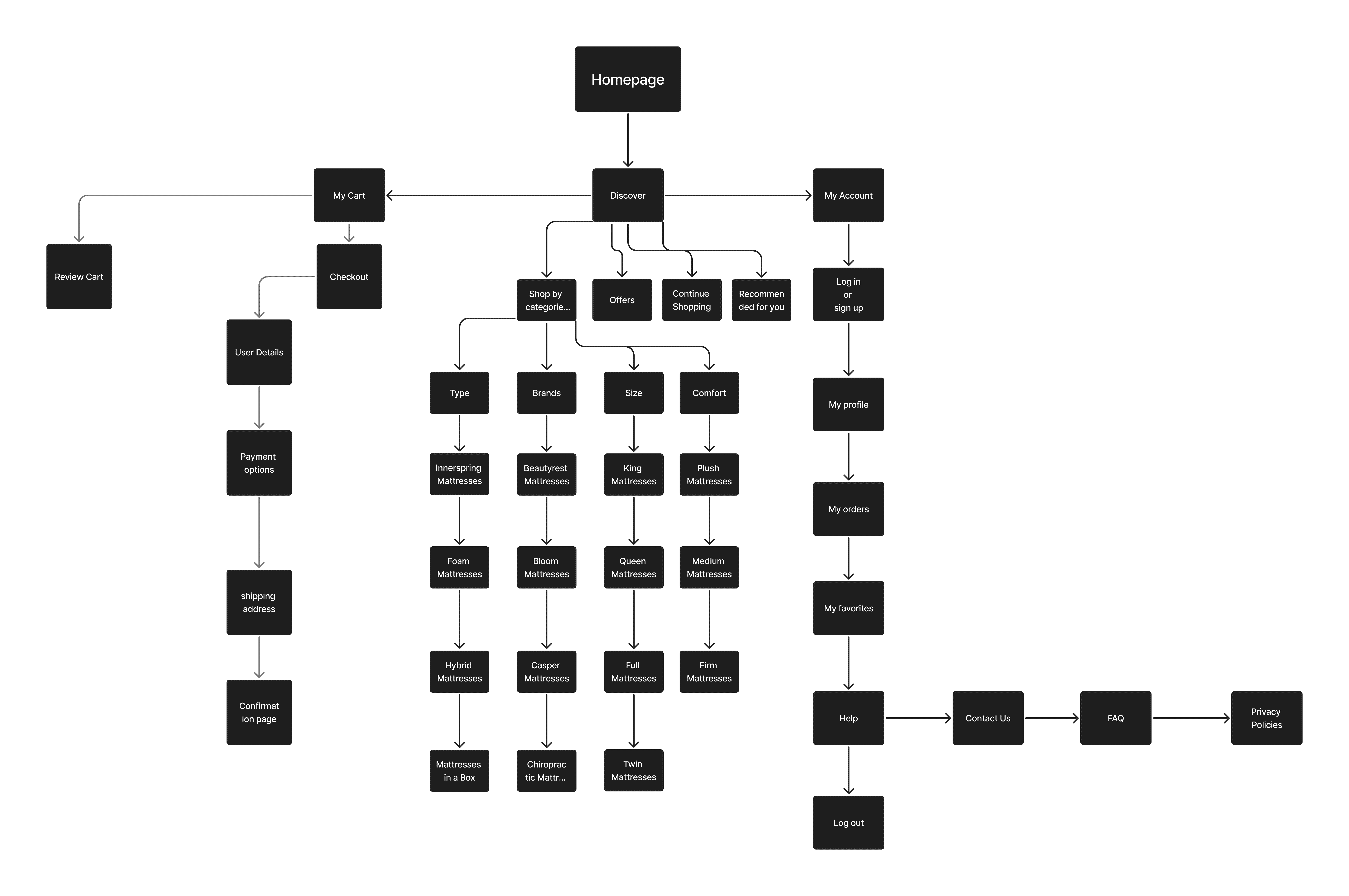
With the research findings in hand, the next step was to map out the structure of the app before touching any visuals. I used FigJam to build the sitemap, which helped me think through how a user would navigate the app from entry to checkout.
The app is organised around three main sections from the homepage — Discover, My Cart, and My Account. The Discover section carries the most depth, allowing users to shop by Type, Brand, Size, and Comfort level, each branching into specific mattress categories. This structure was a direct response to the research finding that users felt overwhelmed by choice — by organising products into clear categories, the goal was to make browsing feel guided rather than chaotic.
The Cart flow was kept deliberately linear — Review Cart → Checkout → User Details → Payment → Shipping → Confirmation — to reduce friction at the most critical stage of the purchase.
The Account section covers profile management, order history, and favourites, while the Help section connects users directly to Contact Us, FAQs, and Privacy Policies — addressing the pain point around lack of customer support.
User Flow
Once the sitemap defined the structure, I mapped out the user flow to understand the step-by-step journey a user takes through the app — from opening it for the first time to completing a purchase.
The flow begins with onboarding and a welcome screen, easing the user into the experience before landing on the homepage. From there, users have two paths to find a product — they can either Explore by browsing categories or use the Search function to find something specific. Both paths converge at the Select Item stage, keeping the experience flexible without adding complexity.
Once an item is selected, the purchase journey becomes intentionally linear. The user adds to cart, reviews their cart, proceeds to checkout, and logs in before selecting a payment method. The payment step branches into two options — Credit/Debit card or Cash on Delivery — before reaching order confirmation.
This flow was designed with one goal in mind: minimise the number of decisions a user has to make at each step. Every stage moves the user forward without dead ends or unnecessary friction, making the checkout experience feel as smooth and trustworthy as possible.

Lo-Fi Prototype
With the structure and flow defined, I moved into Figma to build the low-fidelity prototype. At this stage the focus was entirely on layout, hierarchy and functionality — not colours, images or visual polish. The wireframes were deliberately kept grey and stripped back so that feedback would stay focused on the experience rather than the aesthetics.
The prototype covered all the core screens a user would encounter — the homepage with category browsing and personalised recommendations, a product detail page showing specs and description, a category listing page with sort functionality, the cart and checkout flow including order details and payment selection, and supporting screens like My Account, My Orders, Wishlist, Help, and the Compare feature.
One screen I paid particular attention to was the Compare Your Cart view — a direct response to the research finding that users struggled to differentiate between products. Laying out comfort level, type, cooling, motion isolation, warranty and price side by side gave users a clear, scannable way to make a decision without having to jump between pages.
I also rethought the rating system at this stage. Instead of a single overall star rating, I broke it down into five individual metrics — Comfort, Support, Cooling, Motion Isolation, and Value — each rated separately. The average of these five scores then becomes the overall product rating. This made ratings far more meaningful and transparent, helping users understand exactly what they were buying rather than relying on a single number that tells them very little.
The Help screen also came directly from the research — offering both a Shopping Assistant and a Sleep Experts option addressed the pain point around lack of customer support in a way that felt personal rather than generic.

User Testing
Once the low-fidelity prototype was ready, I conducted user testing to validate the design before moving into high fidelity. Rather than asking users directly "what did you find confusing?" — which tends to lead their answers — I gave them simple, task-based scenarios and observed how they navigated through them naturally.
Tasks included things like:
"Add a mattress to your cart and proceed to checkout"
"Go to your wishlist and compare your items"
The goal was to watch where users hesitated, took a wrong turn, or had to think too hard — without me influencing their experience by pointing things out. After they completed each task, I followed up with open-ended questions to understand their thought process and whether anything had felt unclear or frustrating.
This method was important because it surfaced real problems rather than assumed ones. When you ask users leading questions, they often tell you what they think you want to hear. By letting them interact with the prototype first, the pain points revealed themselves naturally through their behaviour.

Hi-Fi Prototype
With the wireframes validated through user testing, I moved into the high-fidelity stage. To speed up the process, I used Lovable — an AI-powered design tool — to generate the initial hi-fi screens based on the structure and decisions established in the lo-fi prototype.
From there, I refined the output to align with the design direction I had in mind — a warm beige and dark navy colour palette, clean typography, and a layout that felt premium but approachable. The focus was on ensuring that every screen reflected the research findings rather than just looking polished on the surface.
The final screens covered the full user journey — from the homepage and product discovery through to the cart, comparison view, checkout, and account management — bringing together everything that had been planned, researched, and tested throughout the process.

Key Features
Compare Your Cart The research made it clear that users struggled to choose between products. The Compare feature lets users view multiple mattresses side by side, comparing comfort, type, cooling, motion isolation, warranty and price — all in one place. This turns a confusing decision into a confident one.
Redesigned Rating System Instead of a single star rating, each mattress is rated across five individual metrics — Comfort, Support, Cooling, Motion Isolation, and Value. The average of these becomes the overall score. This gives users a much more honest and detailed picture of what they're buying.
Sleep Specialist Access One of the biggest gaps in existing mattress apps was the absence of human support. Users can connect directly with a sleep expert through call or chat for personalised guidance — replicating the in-store assistance experience digitally.
In-App Benefits Highlights offers, trials, and exclusive deals within the app, adding value and encouraging users to complete their purchase with confidence.
Easy Assistance Provides quick support through chat or guided prompts, helping users navigate the app and resolve queries without friction — so no one gets stuck mid-purchase.
Reflection
One of the biggest learnings from this project was understanding how much user research and testing shape the quality of design decisions. Without the survey findings, I would have designed around assumptions — and likely built something that looked good but didn't actually solve the right problems.
Having a research foundation kept me anchored. Every major decision — the comparison feature, the rating system, the sleep specialist access — came directly from something a user said or struggled with. It gave the design a clear purpose at every stage.
User testing reinforced this even further. Watching real people interact with the prototype revealed friction points I had completely overlooked, things that felt obvious to me as the designer but weren't intuitive to someone using it for the first time. Without that step, those issues would have made it all the way into the final design.
The process taught me that good design isn't just about ideas — it's about staying close to the person you're designing for and being willing to let their experience guide your decisions over your own instincts.
